What the site holds
I designed a system of reusable components under the pages people actually use: authentication, a user dashboard, payment, course pages, a news section, and downloadable resources.
 SHEY
shayeste.hosseini1381@gmail.com
SHEY
shayeste.hosseini1381@gmail.com
02 — Website
I designed the complete interface for an educational consulting platform focused on university admission guidance, keeping usability and consistency across a long content site.
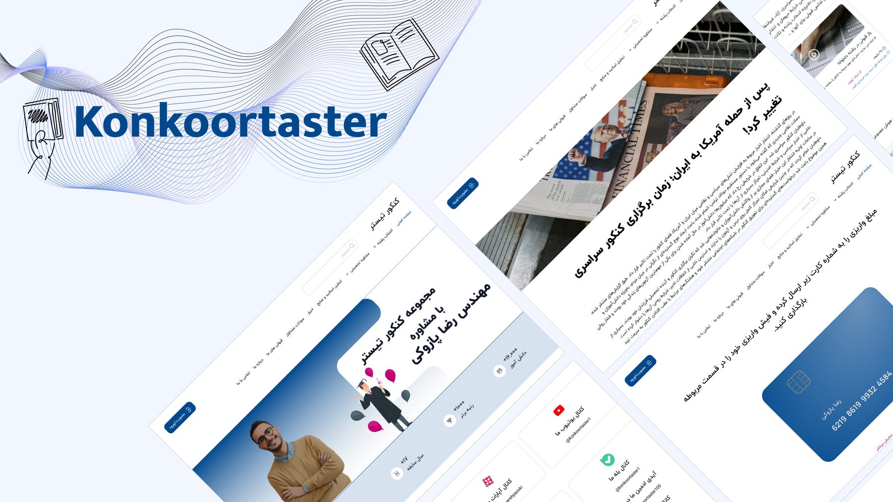
I designed a system of reusable components under the pages people actually use: authentication, a user dashboard, payment, course pages, a news section, and downloadable resources.
The visual language is academic without feeling stiff — deep blue, generous white space, and a clear call to action on every major surface. News, consultation, and payment stay recognizable as one product.
University admission guidance asks people to compare options under pressure. The interface keeps navigation, forms, and content blocks consistent so the next step is always obvious.