03 — UX case study

DrTime

I used this case study to turn user research into a booking flow that helps people choose a doctor faster, and with more confidence.

Role
UX / UI
Research
30 people
Method
Questionnaire
Audience
Ages 20–40

Open the Figma file Read the LinkedIn post

The problem

Booking a doctor online asks for a decision before the useful facts are visible. People do not know how long they will wait, which specialist actually fits, or whether their insurance will cover the visit. That uncertainty is what I set out to remove.

The aim

Help someone make a faster, more confident choice. The work runs the full path I described for this study: research, a clear problem, wireframes, the interface, and a final flow that can be walked from home to a confirmed visit.

  1. 01

    Research

    A qualitative questionnaire with people who already book doctors online.

  2. 02

    Define

    Three blockers: specialist choice, waiting time, and insurance.

  3. 03

    Structure

    A flow for people who know the doctor, and people who do not.

  4. 04

    Interface

    Screens that show wait, fit, and insurance before anyone commits.

  5. 05

    Prototype

    Home, booking, sign-in, patient details, and an assistant.

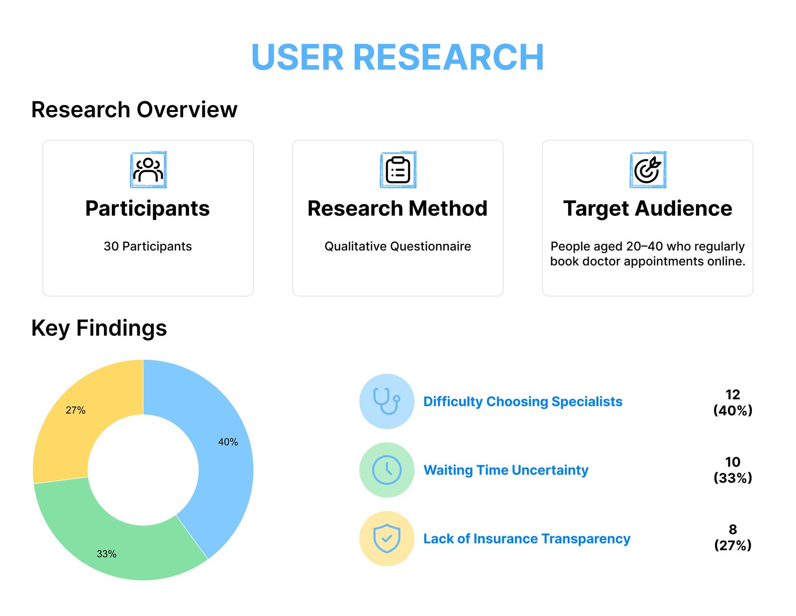
User research overview: 30 participants, qualitative questionnaire, and three key findings
Difficulty choosing specialists 40%
Waiting time uncertainty 33%
Lack of insurance transparency 27%

Who I asked

Thirty people, aged 20–40, who regularly book doctor appointments online. The method was a qualitative questionnaire.

What I changed because of it

Choosing a specialist was the largest problem, so the home screen leads with specialties and recommended doctors, and an assistant can turn a description of symptoms into a shortlist. Waiting time is shown as an approximate wait on the specialist card, then as real slots on the booking screen. Insurance is named on the card before the visit is booked, so cost is not a surprise at the end.

Two ways in

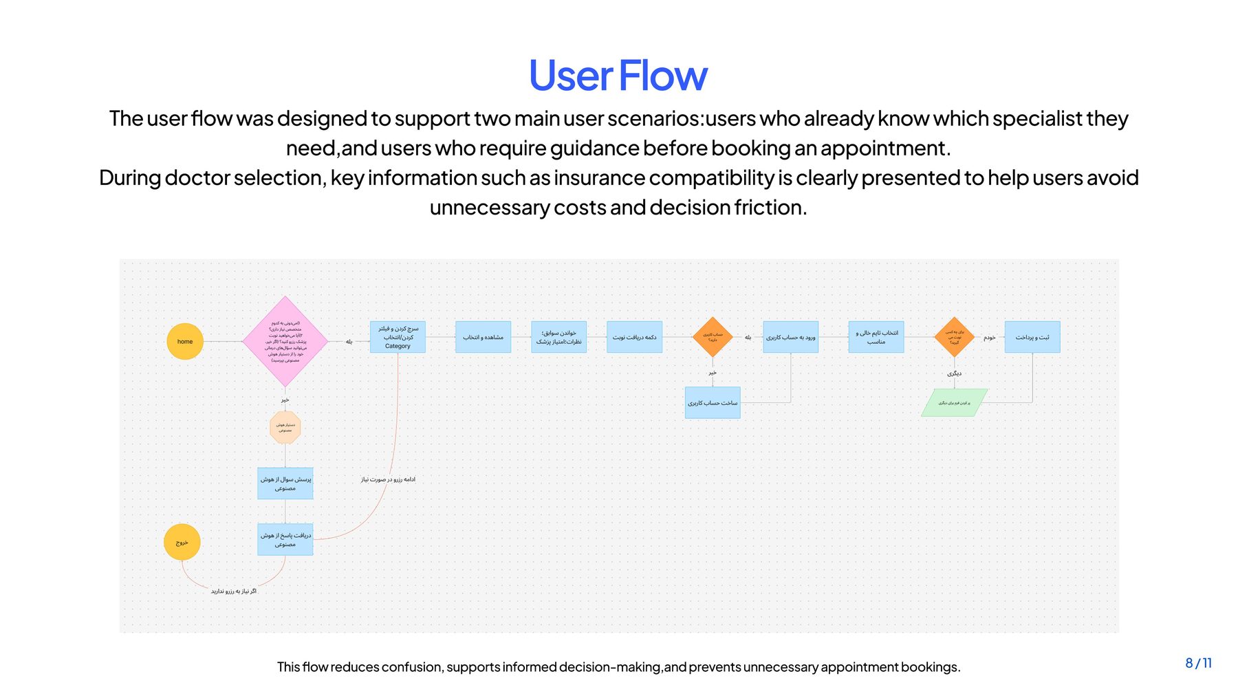
The flow supports people who already know which specialist they need, and people who need guidance first. During doctor selection, insurance compatibility stays visible so a person can avoid a visit they would have to pay for unexpectedly.

DrTime user flow diagram with two entry scenarios
From home, or from a person who already has a doctor in mind, through specialist choice, insurance, and the booking itself.
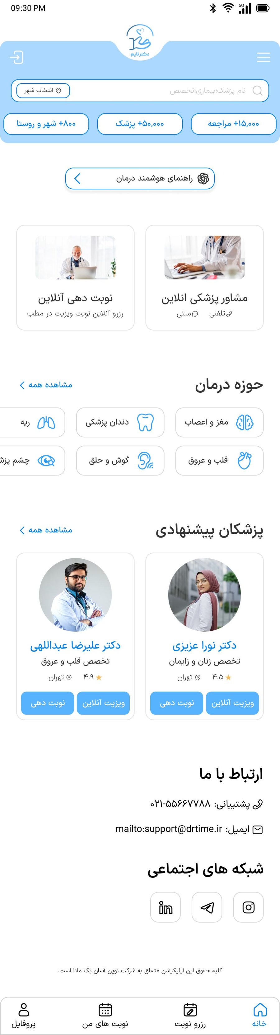
DrTime home with online visit, specialties, and recommended doctors
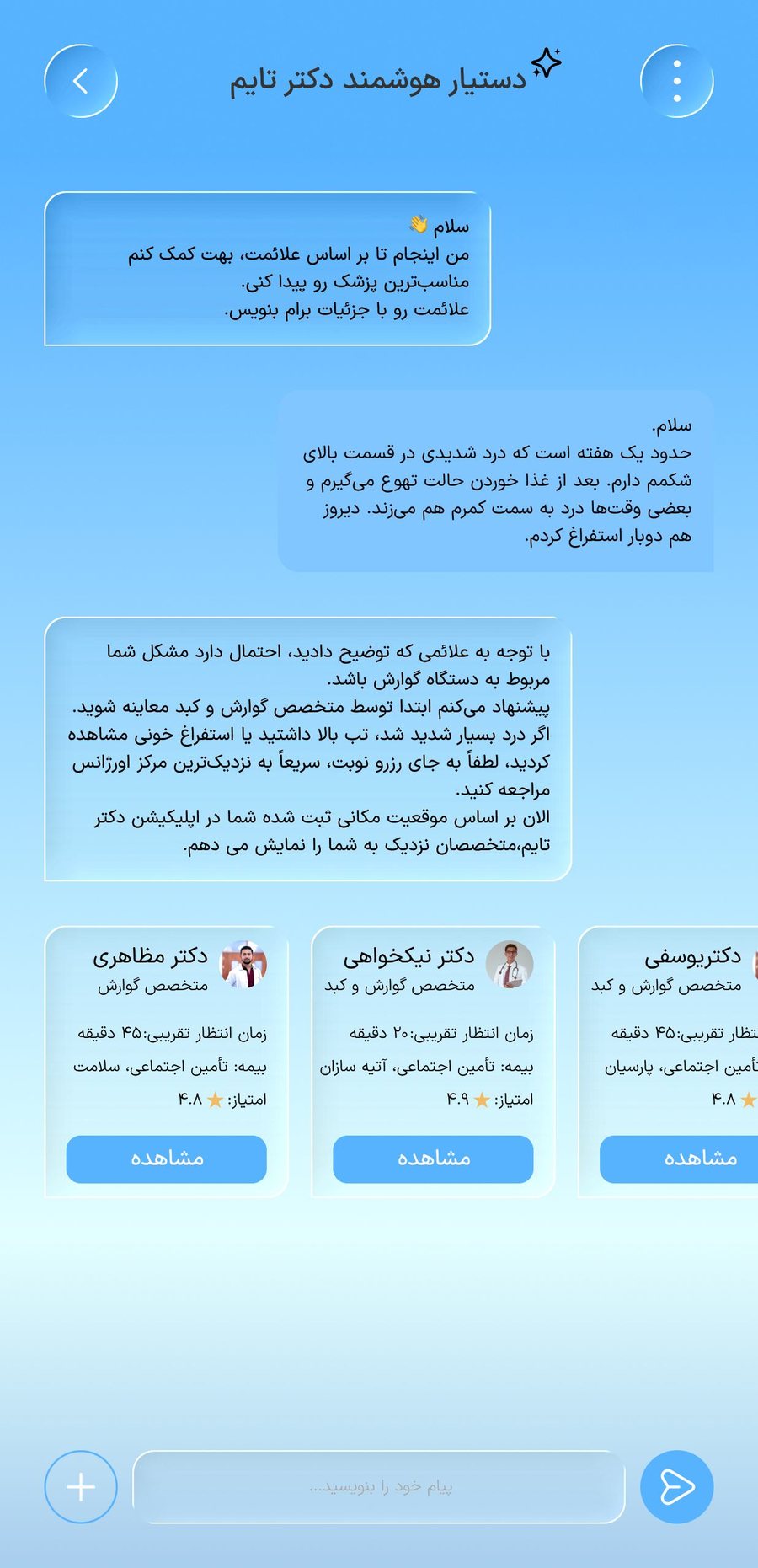
DrTime assistant suggesting specialists from described symptoms
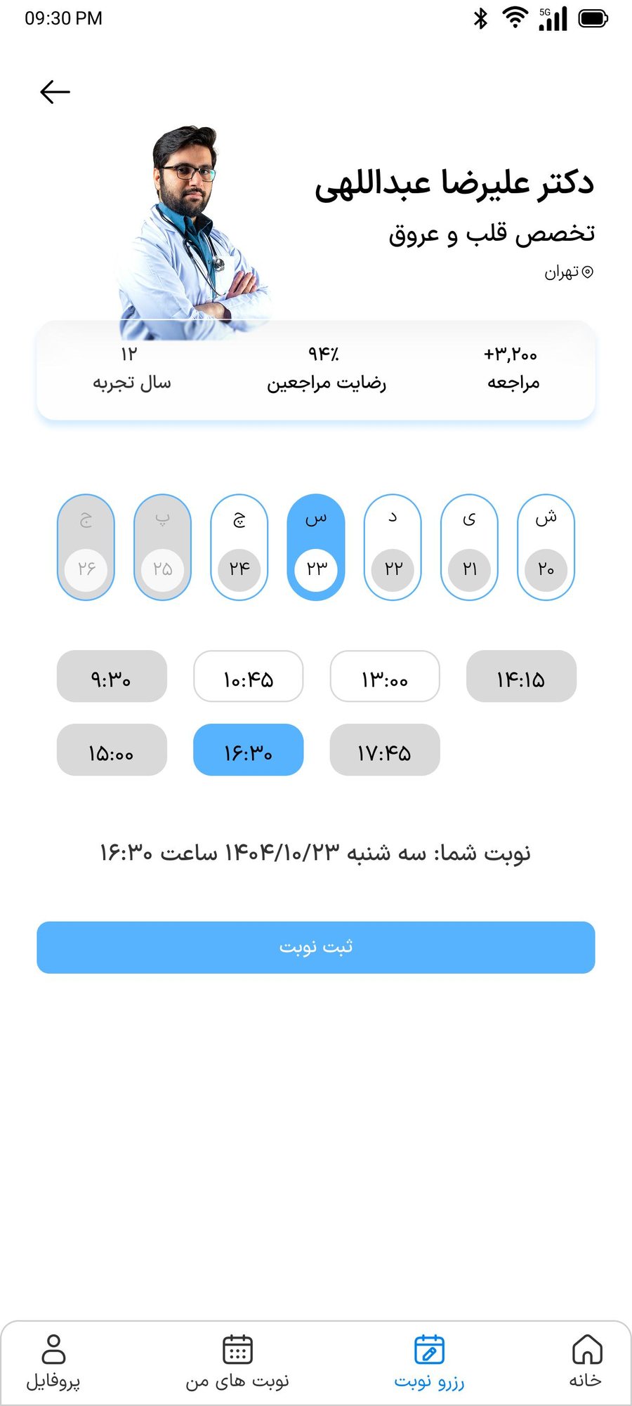
Doctor profile with date and time selection before confirming an appointment
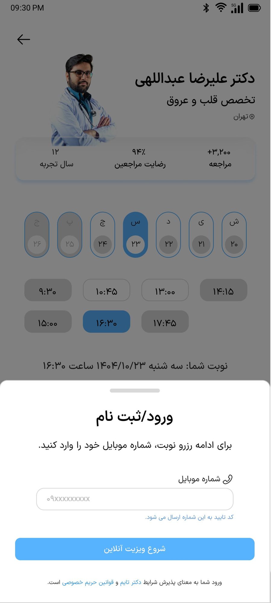
Sign-in sheet over the selected appointment slot
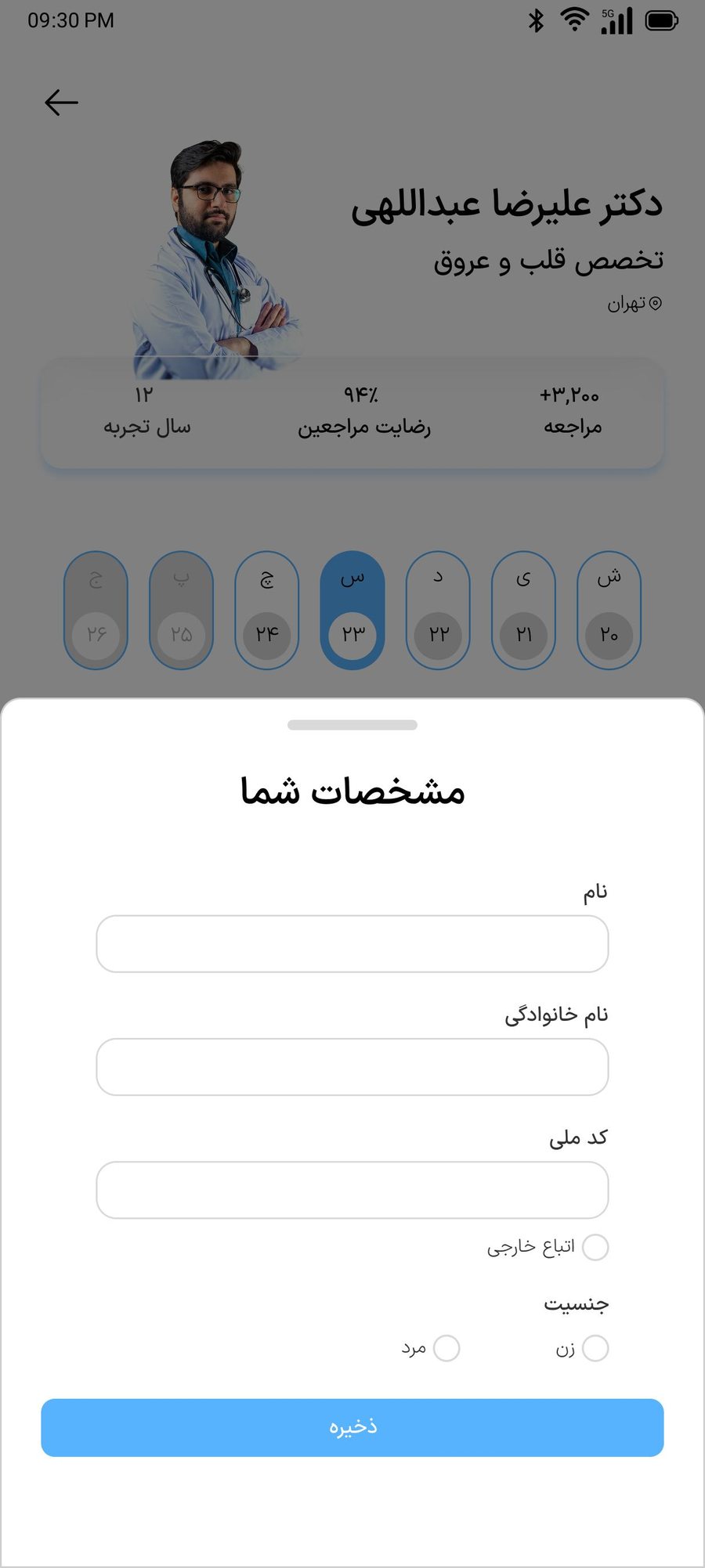
Patient details form with name, national ID, and gender

Home, the assistant, slot selection, sign-in, and patient details. Each specialist card carries an approximate wait and the insurance it accepts.